ar be de es fr hi it ja nl pl pt ru tr uk uz zh en
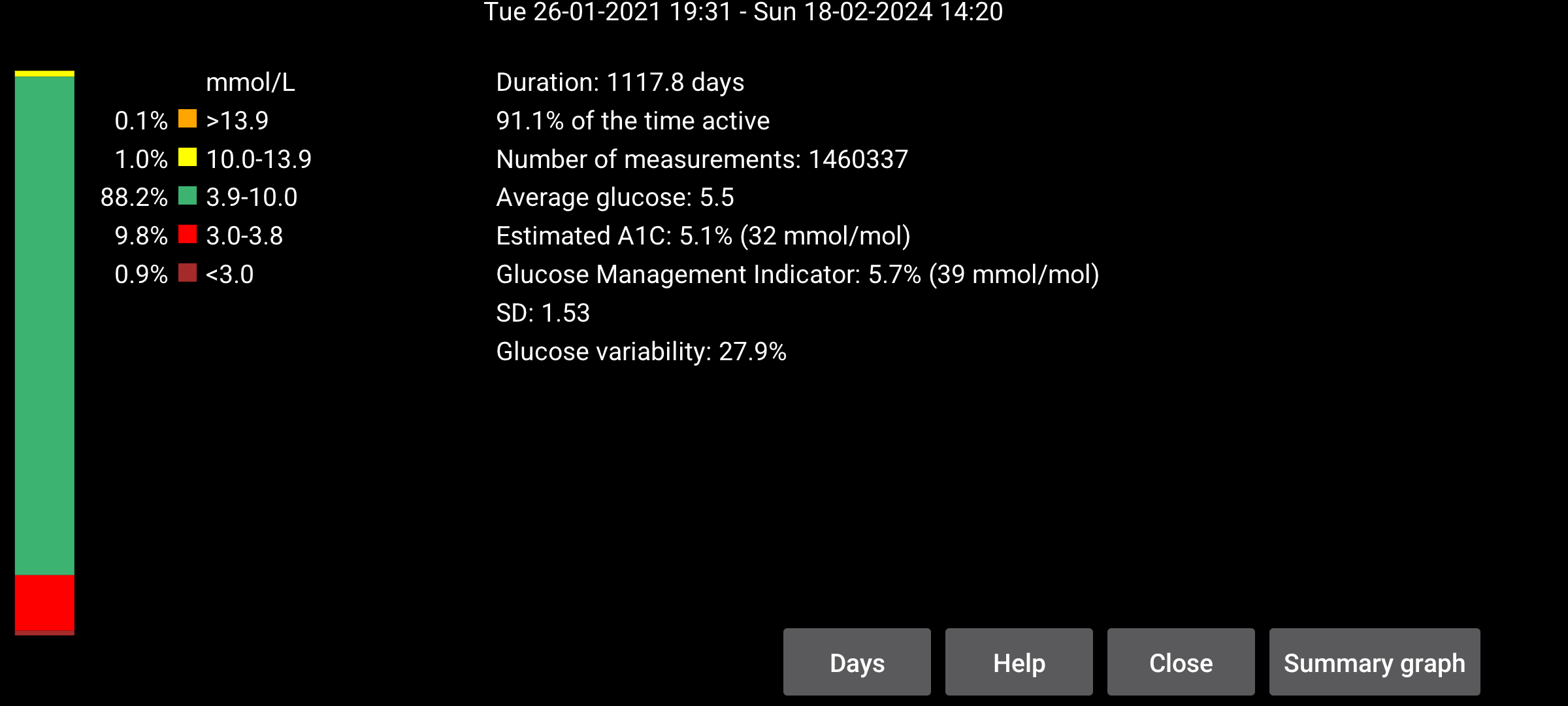
Some statistics taken from AGP with some minor modifications.
The number of days analyzed can be modified by pressing the Days button. The period ends at the time of the end of screen position and spans the specified number of days back in time. All data are only based on glucose values received every minute via Bluetooth from the sensor (called stream in Juggluco).
On the left of the screen are the percentages of measurements that fall within certain glucose ranges. The standard ranges are always shown. When a non-standard target range is specified in left menu->Settings->Display, the time in range of that target range is displayed below the standard ranges.
The percentage of time Juggluco received glucose values from the sensor.
Estimates HbA1c from the average glucose using an older formula (Nathan et al., 2008). See https://professional.diabetes.org/diapro/glucose_calc for a calculator.
It is shown here in case people are looking for the value shown in Abbott's Libre 2 app. GMI is a 2018 replacement for this indicator.
Calculated from the average glucose with a certain generally used formula (see https://www.jaeb.org/gmi/). It is an empirically determined prediction of HbA1c (also called A1c), given in percentage and mmol/mol. For me personally Estimated A1C is a better predictor than GMI, but GMI is used in Abbott's Libre 3 app.
The coefficient of variation, %CV=(SD/mean)*100%, as a measure of glucose variability. A higher coefficient of variation means that the glucose values are further from the mean.
This presents a report of your glucose values of the specified days. It contains statistics, the overview graph and an image of separate days. You can print it to PDF and e-mail it to your healthcare professional. You need to have activated left menu→Settings→Exchange data→Web server. It opens url http://127.0.0.1:17580/x/report in the web browser.
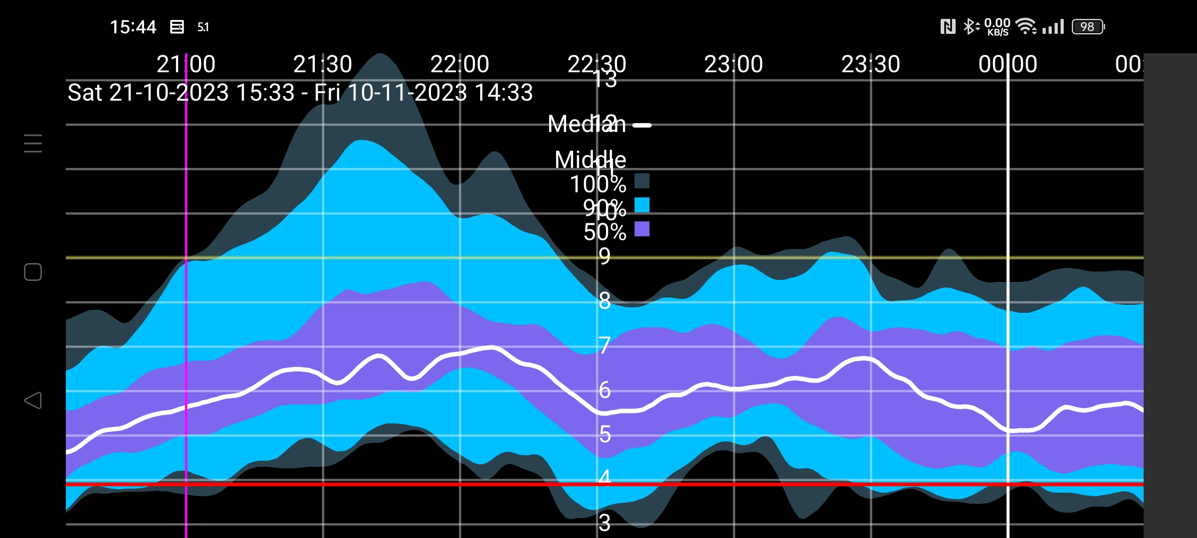
(Only shown when at least 9 days of stream glucose values are available.)
All stream glucose values in this period are taken to draw a composite graph showing for every minute of the day how glucose values were distributed. The black or white median line shows the glucose value below which 50 percent of the glucose values lie at each minute of the day. The lightest blue is the area in which all values lie. Somewhat darker blue the area around the median wherein 90% of the values lie. The darkest blue the area around the median of 50 percent of the values. If you see the borders of the areas as lines, you can also portray it as follows: Under the lowest line are 0% of the values, under the second lowest line (between the lightest blue and the middle dark blue) 5% of the values, below the third line (between the darkest blue and middle dark blue) 25 % of values, below the black line 50% of values. Followed by 75%, 95% and 100%.
For aesthetic reasons, the curve is smoothed with a binomial filter.
Tap anywhere on the screen to close the Summary graph — except the left or right edge, which moves the graph backwards or forwards through the day. The curve can also be moved back and forwards by scrolling. The time scale can be changed by moving two fingers to or from each other.